EnrichmentScope Object
The EnrichmentScope is a dedicated module within OmicScope designed for conducting in silico enrichment analyses. It offers two primary types of enrichment analyses: Over-Representation Analysis (ORA) and Gene-Set Enrichment Analysis (GSEA). These analyses are powered by the Enrichr libraries, providing access to over 224 databases for thorough analysis.
To perform enrichment analysis, users must initially import and perform statistical analysis using the OmicScope module.
The OmicScope object is used to perform Enrichment Analysis in the EnrichmentScope module. It’s important to note that ORA uses differentially regulated proteins found in OmicScope, while the GSEA algorithm uses all quantified proteins to perform the statistical analysis.
To perform enrichment analysis, users also need to select appropriate
databases, with KEGG_2021_Human used by default. Users can also
define alternative background sizes, target organisms, or pAdjusted
cutoffs to consider terms enriched.
import omicscope as omics

data = omics.OmicScope('../../tests/data/proteins/progenesis.xls', Method = 'Progenesis')

ora = omics.EnrichmentScope(data, Analysis='ORA', dbs = ['KEGG_2021_Human'])
OmicScope v 1.4.0 For help: https://omicscope.readthedocs.io/en/latest/ or https://omicscope.ib.unicamp.brIf you use  in published research, please cite:
'Reis-de-Oliveira, G., et al (2024). OmicScope unravels systems-level insights from quantitative proteomics data

User already performed statistical analysis
OmicScope identifies: 697 deregulations
Enrichment results
Enrichment results are stored in object.results as a table
(DataFrame), with the following columns:
Column Name |
Description |
|---|---|
Gene_set |
Gene set library used for enrichment analysis |
Term |
Enriched term |
Overlap |
Ratio of proteins overlapped in the experimental gene list and the total number of genes in the library term |
P-value |
Nominal p-value from Fisher’s exact test |
Adjusted P-value |
Adjusted p-value according to Benjamini-Hochberg (pAdjusted) |
Combined Score (ORA only) |
Score for the enrichment analysis |
Genes |
Genes overlapped between experimental data and the database |
-log10(pAdj) |
Log-transformed pAdjusted value |
N_Proteins |
Number of proteins overlapped between the experimental gene list and the target library term |
Regulation |
Log2(foldchange) of each protein overlapped |
Down-regulated |
Number of down-regulated proteins |
Up-regulated |
Number of up-regulated proteins |
Normalized Enrichment Score (NES) (GSEA only) |
An attempt to predict the effect of proteins on pathways (specific to GSEA analysis) |
ora.results.head(4)
| index | Gene_set | Term | Overlap | P-value | Adjusted P-value | Old P-value | Old Adjusted P-value | Odds Ratio | Combined Score | Genes | -log10(pAdj) | N_Proteins | regulation | down-regulated | up-regulated | |
|---|---|---|---|---|---|---|---|---|---|---|---|---|---|---|---|---|
| 0 | 0 | KEGG_2021_Human | Parkinson disease | 58/249 | 1.704579e-31 | 4.789868e-29 | 0 | 0 | 9.082385 | 643.458087 | [NDUFA11, CALML3, COX6A1, UBE2L3, TUBB8, UCHL1... | 28.319676 | 58 | [0.2670808325175823, -0.10715415448907055, 0.7... | 33 | 25 |
| 1 | 1 | KEGG_2021_Human | Pathways of neurodegeneration | 78/475 | 6.471702e-31 | 9.092742e-29 | 0 | 0 | 6.000855 | 417.135594 | [NDUFA11, CALML3, ATP2A1, COX6A1, UBE2L3, TUBB... | 28.041305 | 78 | [0.2670808325175823, -0.10715415448907055, -0.... | 51 | 27 |
| 2 | 2 | KEGG_2021_Human | Prion disease | 54/273 | 1.174929e-25 | 1.100517e-23 | 0 | 0 | 7.318264 | 420.093386 | [NDUFA11, COX6A1, TUBB8, PPP3CB, TUBB6, PPP3CC... | 22.958403 | 54 | [0.2670808325175823, 0.7932637717587971, -0.33... | 29 | 25 |
| 3 | 3 | KEGG_2021_Human | Amyotrophic lateral sclerosis | 61/364 | 8.377698e-25 | 5.885333e-23 | 0 | 0 | 6.014281 | 333.426032 | [NDUFA11, COX6A1, ACTG1, TUBB8, ACTR1A, PPP3CB... | 22.230229 | 61 | [0.2670808325175823, 0.7932637717587971, -0.22... | 38 | 23 |
Background - ORA only
When conducting Over-Representation Analysis (ORA), the background gene list assumes a pivotal role in enrichment analysis by serving as the reference set against which the experimental gene list is compared. To put it simply, the background gene list encompasses all the genes or proteins that could potentially be present in the experimental dataset.
By default, when background = None, EnrichmentScope includes all
genes found in the database as part of the background. Alternatively,
users have the option to set background = True to encompass all
proteins identified in the experiment. They can also use
background = int to specify the background size, which could be, for
instance, the reviewed human proteome in the case of human experiments
(although this is not recommended). Another option is to define
background = [ListOfGenes] to specify a particular gene set for
comparative analysis.
Plots and Figures
EnrichmentScope introduces a variety of figures that aim to integrate the enrichment outcomes with the differentially regulated proteins in biological systems.
Users can choose between saving the generated plots in vector format
(using vector=True) or in .png format (with vector=False). They
have the flexibility to set the desired figure resolution (using
dpi=300) and specify a file path for saving the plots. Moreover,
users can adjust the color schemes of the plots using the “palettes”
command, selecting color palettes from Matplotlib. These customizable
options empower users to create informative and visually appealing
visualizations that cater to their specific requirements and preferences
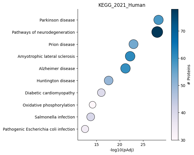
Dotplot - object.dotplot()
The dotplot function ranks enriched terms on the y-axis based on
their adjusted p-values, while the x-axis represents the adjusted
p-values. Additionally, the size of each dot is proportional to
-log10(pAdjusted), providing an indication of the significance of the
enrichment. Furthermore, the color of each dot is coded based on the
number of proteins used in the enrichment analysis.
How to interpret: The positioning of each dot on the plot indicates the statistical significance of the term, with more statistically significant terms located towards the top-right side of the plot. Additionally, the color of each dot corresponds to the number of proteins associated with that term, with darker blue indicating a higher number of associated proteins.
ora.dotplot(dpi=90, palette='PuBu')
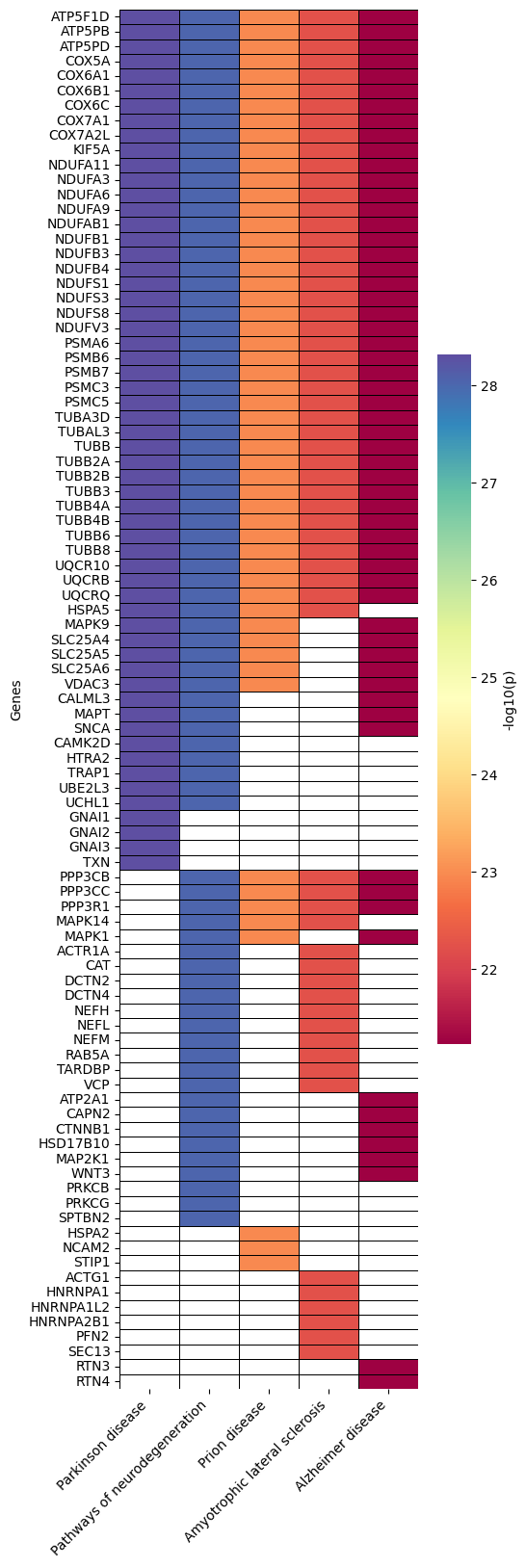
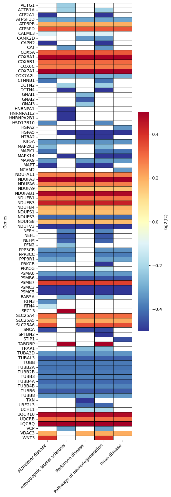
Heatmap - object.Heatmap()
The heatmap is a valuable tool within the EnrichmentScope workflow, aiding in the visualization of proteins that are shared between enriched terms, helping to reduce data redundancy. In this heatmap, proteins are depicted on the y-axis, while terms are assigned to the x-axis.
By default, the heatmap colors are mapped according to the adjusted
p-value. However, users have the option to color each protein based on
its fold-change by setting foldchange=True.
How to interpret: When looking for specific proteins, users can identify the specific pathways (terms) associated with those proteins. Conversely, when exploring several pathways, users can observe the group of proteins that are shared between those pathways (terms). In the examples provided below, we highlight the default parameters and color coding based on fold change.
ora.heatmap(linewidths=0.5)
# color based on protein fold-change
ora.heatmap(linewidths=0.5, foldchange=True)
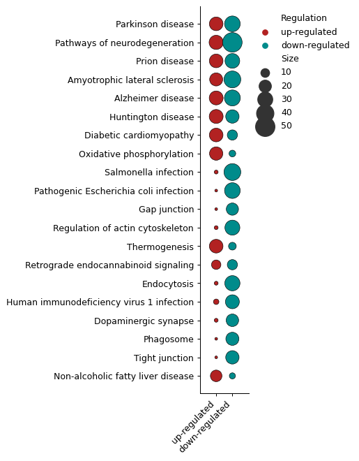
Number of DEPs - object.number_deps()
The number_deps function counts the number of up- and down-regulated
entities (x-axis) and plots them according to each enriched term
(y-axis). In this plot, sizes indicate the number of proteins found in
each group.
How to interpret: For users performing ORA and GSEA analyses, questions often arise about the number of up- and down-regulated proteins associated with each term.
ora.number_deps(palette=['firebrick','darkcyan'] ,dpi = 90)
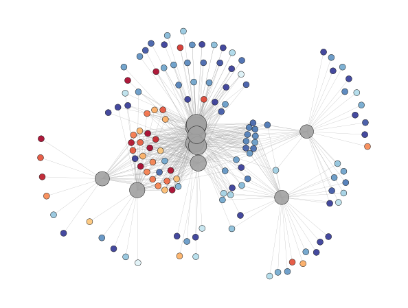
Enrichment Network - object.enrichment_network()
In proteomics, major pathways frequently share several proteins, and visualizing pathways and proteins together in a network can be highly informative.
The Enrichment Network function visually connects terms to their
associated proteins. In this visualization, terms are depicted in gray,
and the node size is proportional to -log10(p-adjusted). Proteins
are represented uniformly in size and are color-coded based on their
fold-change. Labels can be added to the plot by using the
labels=True option (default: False).
Note: Note: Visualizing graphs can be complex, particularly when
dealing with substantial amounts of information. To achieve the best
visualization possible, several software options, such as Cytoscape and
Gephi, have been specifically designed for this purpose. Users can
export the plot to these external tools by specifying
save=PATH_TO_SAVE.
ora.enrichment_network(top = 10, dpi = 90)
[<networkx.classes.graph.Graph at 0x182bed80d90>]
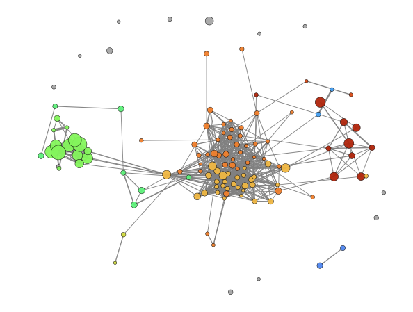
Enrichment Map - object.enrichment_map()
An advantageous aspect of employing graphical representations in
enrichment analysis is their ability to reduce data redundancy. The
enrichment_map function takes advantage of this by rendering nodes
as terms and edges as similarity scores, typically calculated using
statistical metrics such as Jaccard similarity (default). If users opt
to enable modules=True, the Louvain method is utilized to identify
communities within the network. Each community is assigned a unique
term, typically the one with the highest degree, to describe the
community when labels=True is specified.
Similar to the enrichment_network function, users can easily export
the generated enrichment map to external tools for further exploration
and visualization by adding save=PATH_TO_SAVE.
How to interpret: While aiming to investigate pathways that share proteins, users can look inside modules to identify pathways that present high similarity regarding protein presence. On the other hand, while avoiding redundancy, users can look for the node that presents a higher degree (number of connections) inside each module and/or a lower p-value and consider that node to represent the whole module.
ora.enrichment_map(dpi=90, modules=True)
[<networkx.classes.graph.Graph at 0x182bc0941d0>]