Nebula
Nebula is the module that allows multi-data integration and provides various functions for analyzing independent proteomics experiments. Thanks to the General and Snapshot input workflows performed by OmicScope, Nebula can also analyze multiple datasets in a multi-omics fashion.
Depending on the OmicScope environment you use Nebula, the method to import can vary. While using the OmicScope python package, you must insert all desired .omics files into a folder. On the other hand, while using the OmicScope Web application, the same files must be compressed in a .zip file and then uploaded.
In the sections above, we describe how to generate .omics files and Nebula’s capabilities.
How to Make Nebula Input
Exporting .omics Files - OmicScope.savefile() or EnrichmentScope.savefile()
Both OmicScope and EnrichmentScope offer a convenient function,
savefile, for exporting .omics data. This function enables the
export of quantitative data from OmicScope and quantitative and
enrichment data from EnrichmentScope. Additionally, .omics files are
text files and the information can be accessed using notepad.
Using the OmicScope Web Application
When using the OmicScope web application, the .omics file is compressed into a .zip file that can be downloaded at the end of the process.
Complete your analysis in the web application.
Navigate to the export section.
Download the .zip file containing your .omics data.
Using the OmicScope Python Package
To export .omics files using the OmicScope Python package, simply invoke
the savefile function and specify the folder path where you want to
save the data. (code below)
# OmicScope Example
import omicscope as omics

data = omics.OmicScope('../tests/data/proteins/progenesis.xls', Method='Progenesis')
data.savefile(PATH_TO_SAVE)

# EnrichmentScope Example
# Note: EnrichmentScope also includes QUANTITATIVE DATA
enr = omics.EnrichmentScope(data)
enr.savefile(PATH_TO_SAVE)
Note: By default, the exported file name in OmicScope/EnrichmentScope is derived from the conditions extracted during the analysis. For example, if you analyzed data with conditions “COVID” and “CTRL,” the exported file name would be ‘COVID-CTRL.omics’.
data.Conditions
['COVID', 'CTRL']
Nebula Object
Nebula processes quantitative and enrichment data from .omics files, labeling each study using the imported “experimental condition”. If two or more .omics files present the same “experimental groups” labels, Nebula adds a numerical suffix to differentiate each study (recommendation: modify the experimental groups in the .omics file to avoid this issue).
Since Nebula considers differentially regulated proteins to plot several figures, While importing data into Nebula, users may also define a p-value threshold (defaults to 0.05)
Nebula reports the number of imported groups/experiments, their names, and whether enrichment data is included.
import omicscope as omics

nebula = omics.Nebula('../../tests/data/MultipleGroups/omics_file/')
OmicScope v 1.4.0 For help: https://omicscope.readthedocs.io/en/latest/ or https://omicscope.ib.unicamp.brIf you use  in published research, please cite:
'Reis-de-Oliveira, G., et al (2024). OmicScope unravels systems-level insights from quantitative proteomics data

You imported your data successfully!
        Data description:
        1. N groups imported: 4
        2. Groups: COVID,Covid_HB,NEURONS,SH_DIF
        3. N groups with enchment data: 4
Note: While using the OmicScope python package, the names/colors of each group can be altered via the command line, granting users full control over experiment identification (see below). When using the web app, users can change names/colors using the sidebar.
nebula.groups = ['Astrocytes', 'Human_Brain', 'Neurons', 'SHSY5Y']
nebula.groups
Figures and plots
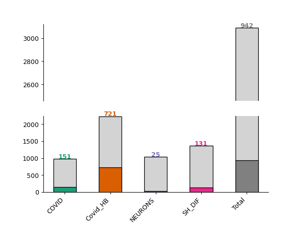
Barplot - object.barplot()
The Nebula barplot displays the number of quantified and differentially regulated proteins/genes (y-axis) across all studies (x-axis).
How to interpret: Each bar represents a study imported into the Nebula module. The colored (or dark gray) bars represent the number of differentially regulated proteins in each respective study, with the exact number displayed at the top of each bar. The light gray bars at the top represent the number of quantified proteins in each experiment.
nebula.barplot(dpi=90)
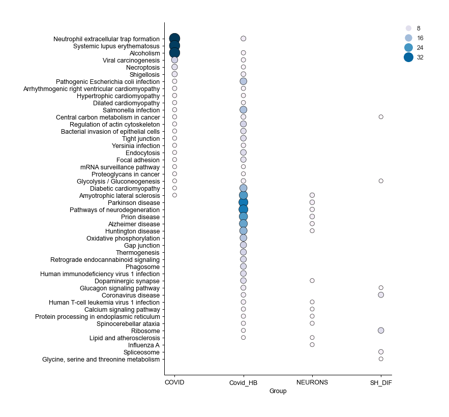
Enrichment Dotplot - object.dotplot_enrichment()
When your .omics files contain enrichment results, you can utilize
the dotplot_enrichment() function to compare the enrichment outcomes
from each imported study.
The function generates a list of the top N terms (by default N = 5) for each imported study based on p-values. This list is then used to filter each enrichment dataset for comparison.
How to interpret: Each dot represents a specific term, with the color and size of the dot proportional to -log10(pAdjusted). This plot is useful for identifying pathways shared among all groups or for noting pathways that are unique to a specific condition compared to others.
nebula.dotplot_enrichment(top=20, dpi=90, fig_height=10)
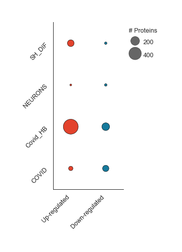
Differentially Regulated - object.diff_reg()
In this plot, Nebula splits down- and up-regulated proteins (x-axis) in each imported study (y-axis), and sizes each dot according to the number of proteins in each condition.
How to interpret: The larger the dot, the higher the number of proteins in that subset of data. This visualization helps to compare the proportional sizes of up- and down-regulated proteins across different studies.
nebula.diff_reg(dpi=90)
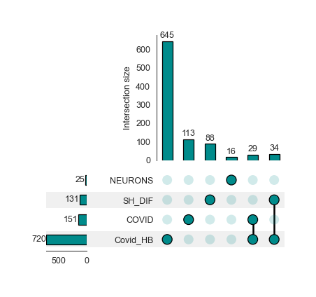
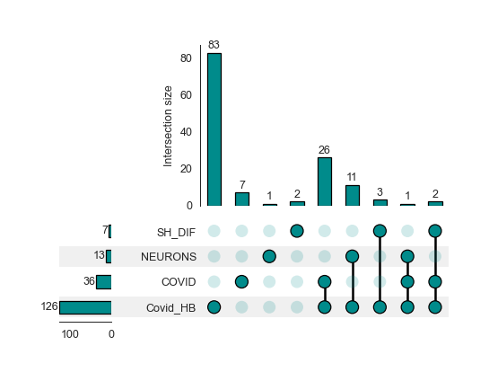
Protein Overlap - object.protein_overlap()
The classic Venn Diagram is a common tool for visualizing overlap and uniqueness between conditions. However, conventional Venn diagram tools have limitations when dealing with multiple conditions due to overlapping constraints. To overcome these limitations, Nebula offers Upset plots to evaluate overlaps at the protein and enrichment levels.
How to interpret an Upset plot: This plot allows for the comparison of multiple studies simultaneously. The lower bar plot presents the number of entities associated with each group. The upper bar plot reveals the intersection size for each comparison, visually represented by colored and linked circles within the frame. A useful approach is to look for comparisons of interest in the frame and then refer to the top bar to see the number of proteins uniquely present in that comparison.
Upset plot - Protein Level
nebula.protein_overlap(dpi=90)
Upset plot - Enrichment Level - object.enrichment_overlap()
nebula.enrichment_overlap(dpi=90)
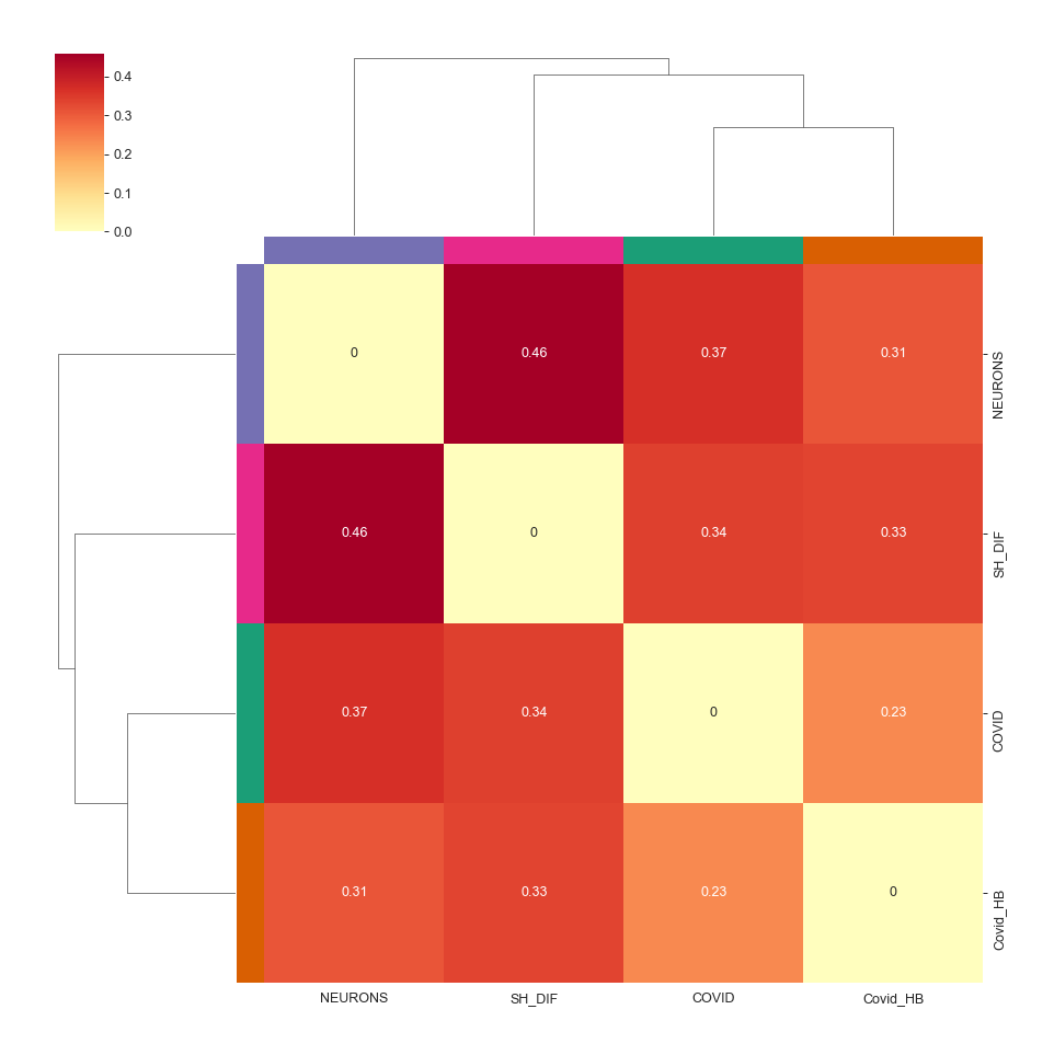
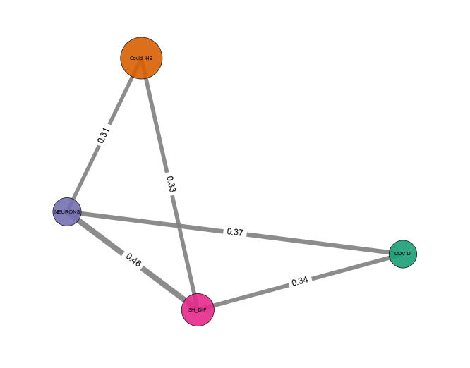
Similarity Analysis
When analyzing multiple groups, a common question is whether there is a metric to evaluate the similarity between studies in a pair-wise fashion. To address this, Nebula calculates similarity indices between imported studies at the protein level.
By default, Nebula performs Jaccard Similarity analysis using proteins present in each respective study. Additionally, users can select other algorithms to calculate distances, such as Pearson and Euclidean, which also consider protein fold-changes to obtain similarity indices.
The results of this analysis are displayed using two approaches: heatmap and network. In the heatmap analysis, all the similarity indices are shown, along with a hierarchical clustering approach to define which studies are closest together. Conversely, the network strategy uses the same results but applies a similarity index cutoff to establish links between studies, offering an alternative and cleaner visualization of results.
Heatmap - object.similarity_heatmap()
How to interpret: The heatmap color-codes the similarity index, with stronger colors indicating higher index values. A higher index value indicates greater similarity between the two evaluated groups. Additionally, hierarchical clustering is performed to enhance the visualization of groups that exhibit greater similarities.
nebula.similarity_heatmap(dpi=90, metric='jaccard')
Network - object.similarity_network()
How to interpret: In the network representation of the similarity analysis, nodes represent imported studies, while links are established based on a similarity index cutoff. The width of the links is also proportional to the index value.
nebula.similarity_network(pvalue=1, absolute_similarity_cutoff=0.3, dpi=90)
Statistical Test
Nebula introduces a statistical assessment to determine if the similarity observed across groups is statistically significant. By applying Fisher’s exact test, the statistical principles used in this analysis are similar to those employed in an Over-Representation Analysis (ORA).
Users have the flexibility to specify a background against which the analysis is conducted. By default, Nebula considers all imported proteins/genes as the background. However, users have the option to define a specific number of genes as the background. For example, users may choose to use the number of reviewed proteins in the Human Proteome database as their defined background for the analysis. This level of customization allows for more precise and context-specific analyses.
Other Statistical Analyses
While using Nebula’s statistical workflow, users can specify alternative methods for performing statistical comparisons. The available options include t-test, Wilcoxon, and Kolmogorov-Smirnov tests. All tests use fold changes from proteins overlapping between pair-wise studies to compute distributions and perform statistical analysis. In these tests, the null hypothesis is that pair-wise studies are similar, and it is rejected if the p-value is lower than a threshold (0.05 by default).
How to interpret: For Fisher’s exact test, two groups are statistically similar if the p-values are <= 0.05. For other statistical approaches, two groups are considered similar if the p-values are > 0.05.
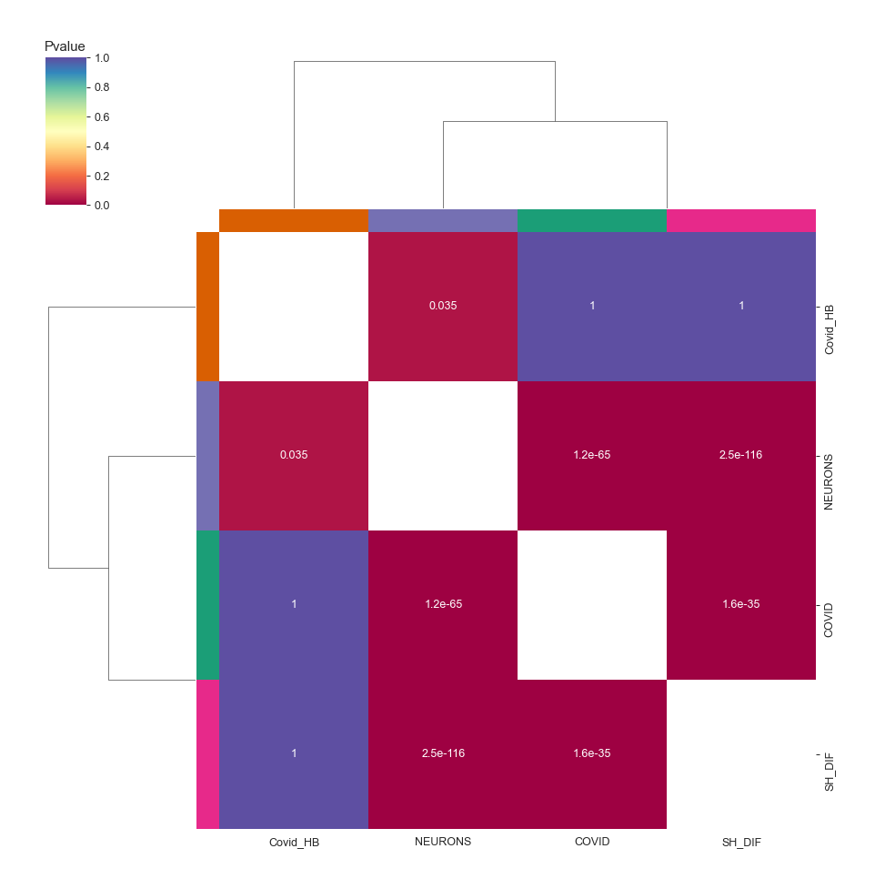
Heatmap - object.stat_heatmap()
How to interpret: The heatmap color-codes the p-values. For Fisher’s exact test, two groups are statistically similar if the p-values are <= 0.05. For other statistical approaches, two groups are similar if the p-values are > 0.05.
nebula.stat_heatmap(pvalue=1, dpi=90)
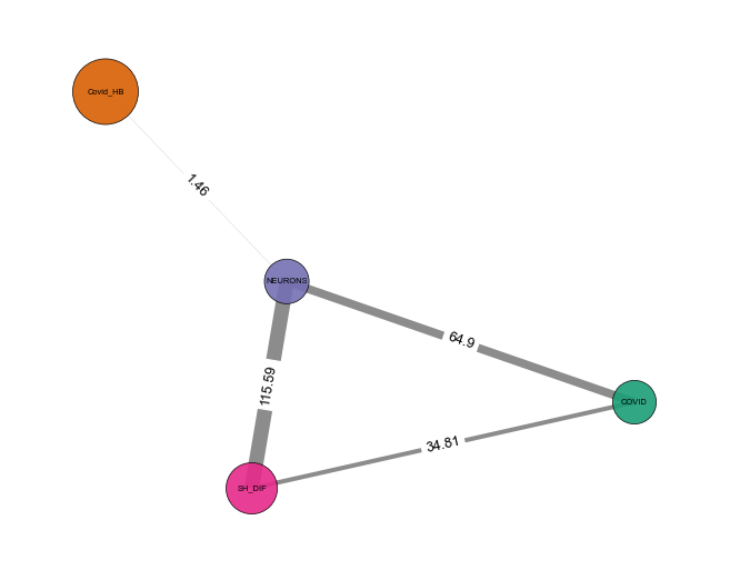
Statistical Network - object.stat_network()
How to interpret: In the network representation of the statistical analysis, nodes represent imported studies, while links are established based on a similarity index cutoff. The width of the links is also proportional to the -log(pvalue).
Note: This function empowers users to filter proteins based on a
specific p-value threshold (default: protein_pvalue=0.05). Users can
also customize edge filtering based on obtained p-value (default:
graph_pvalue=0.05) to assign edges to the graph. The graph’s labels
are displayed in the log10 scale.
nebula.stat_network(protein_pvalue=1, graph_pvalue=0.05, dpi=90)
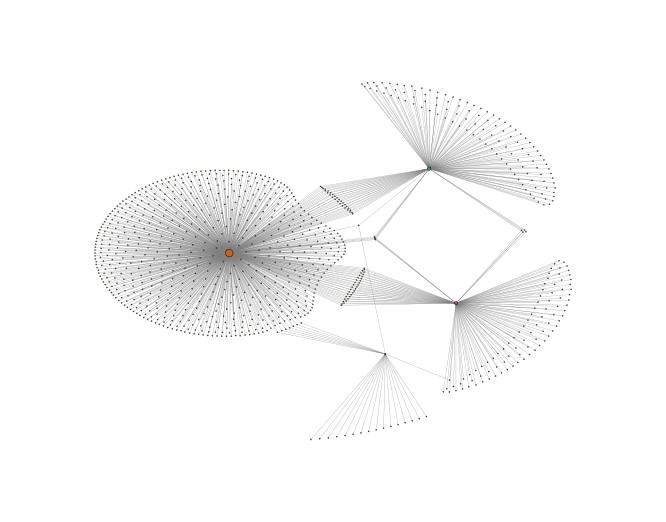
Protein Network - object.whole_network()
The network function in Nebula provides an insightful overview of individual proteins shared among groups. Each study is linked with differentially regulated proteins, enabling easy visualization of proteins shared among imported outcomes. This network can be exported as .graphml files, allowing for network visualization in third-party software to perform systems biology analysis.
nebula.whole_network(dpi=90)
<networkx.classes.graph.Graph at 0x182060adad0>
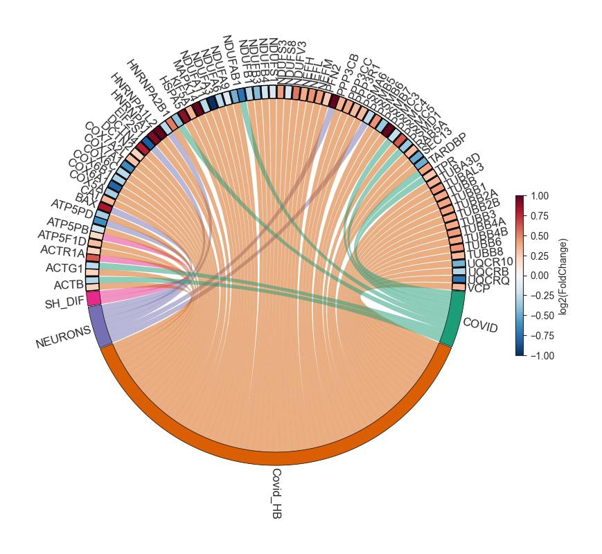
Circular Graphs - object.circular_term()
This plot integrates three levels of information: imported studies, protein details, and enrichment outcomes. Upon selecting a target enrichment term, Nebula generates a circular diagram that links all conditions with proteins associated with the enriched term, displaying the protein fold change for those groups.
How to interpret: Each displayed protein is involved in the pathway/biological process/etc. chosen by the user. The diagram connects the groups where the protein exhibits differential regulation, while also highlighting the fold change in each group.
nebula.circular_term('Amyotrophic lateral sclerosis')
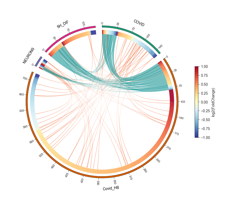
Circos plot - object.circos_plot()
Circos allows users to visualize differentially regulated proteins across multiple groups and highlights shared proteins with dark cyan links. The regulation of the proteins is depicted using an edge heatmap. If the .omics file contains enrichment analysis, the circos_plot function incorporates shared enrichment terms with orange links, offering insights into the number of pathways shared between groups.
nebula.circos_plot(colorenrichment='#F56A33', linewidth_heatmap=0)